
Select Boxes (a.k.a. Listboxes)
Like radio buttons, a select box (known in ARIA as a listbox) is a great way to choose one from a list. While radio buttons are great for a small amount of choices, select boxes are better for a large set of choices.
The TL;DR here is that you can use native <select> tags to create listboxes that are accessible and
give a UI that is best for the device they are being displayed on (which is the recommended variation). If you want to
control every aspect of the design, however, you can do this using ARIA listbox controls to do that.
Please read this entire page before deciding. You don't want to make a decision that you regret as much as the one I made when I didn't invest in the Google IPO back in 2004.
HTML5 native select element example
 This is the best solution to use, especially when building from scratch.
Although native HTML5 select boxes were difficult to style in the past, it is possible to style the default (i.e. closed) state completely using CSS. We have used Scott Jehl's cross-browser CSS demo to style our demo below.
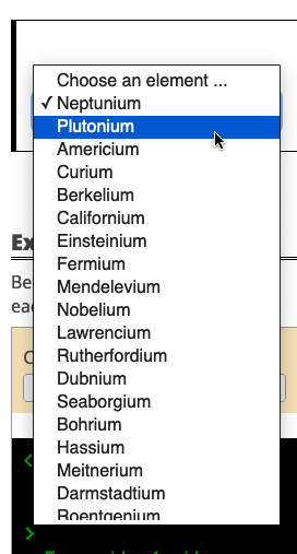
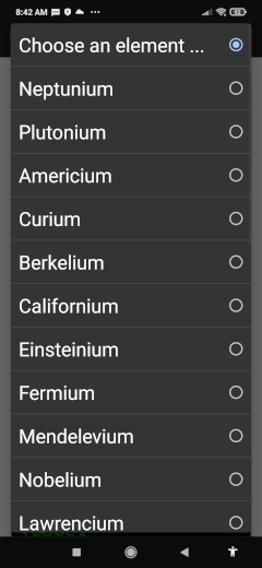
The fact that we still can't style the options within a select box is a feature, not a bug. The gut reaction from a lot of designers is to change their appearance since they understandably want to control every aspect of the design of the user interface consistently across browsers and devices. However, mobile browser manufacturers have optimized the HTML5 select box UI to use the strengths of the platform they run on. Take a look at how the options are displayed when the user activates the control:
| Firefox Desktop | Chrome Android | Safari iOS |
|---|---|---|
|
|
|
Designers can style the closed version of HTML5 select boxes, but not that of the optimized UI. I urge designers to embrace this feature, not a bug mantra for select boxes. You will make your users happier.
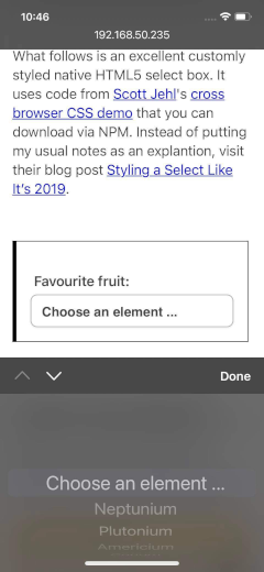
What follows is an excellent custom-styled native HTML5 select box. It uses code from Scott Jehl's cross-browser CSS demo that you can download via NPM. Instead of putting my usual notes as an explanation, visit their blog post Styling a Select Like It's 2019.
Code Walkthrough of the Above Example
Below is the HTML of the above example. Use the dropdown to highlight each of the individual steps that make the example accessible.
ARIA listbox example
 If you are already using a component similar to this in existing work that is not accessible, go to the developer walkthrough in this section to see how we made our implementation accessible.
 This solution described below is available as an NPM module. (Module installation instructions)
This listbox I made is accessible, and I have used it in a few projects in the past. It works well, a developer can
ensure it looks the same in all browsers, and I am happy with the accessibility features in it. However, I strongly
recommend you use the <select> box example instead. Using this library means that:
- You are adding more JavaScript to your application.
- You are not taking advantage of the optimized
<select>box styling for the device using the control. - You are going to spend more development time to get this to work.
If after reading the warning on the label, you decide that still want to use this product, read the code walkthrough and the installation instructions after the demo.
- Supercalifragilisticexpialidociousium
- Plutonium
- Americium
- Curium
- Berkelium
- Californium
- Einsteinium
- Fermium
- Mendelevium
- Nobelium
- Lawrencium
- Rutherfordium
- Dubnium
- Seaborgium
- Bohrium
- Hassium
- Meitnerium
- Darmstadtium
- Roentgenium
- Copernicium
- Nihonium
- Flerovium
- Moscovium
- Livermorium
- Tennessine
- Oganesson
- Neptunium
(Note: The styling of this component is taken from The W3C's Collapsible Dropdown Listbox Example — the script, however, has been replaced with custom code.)
Code Walkthrough of the Above Example
Below is the HTML of the above example. Use the dropdown to highlight each of the individual steps that make the example accessible.
Installation Instructions
You can load this JavaScript library into your application in several ways:
- as an ES6 module using Webpack.
- as a CommonJS module using
require()and Webpack. - as a native ES6 module within the browser.
- as an old-school ES4/JavaScript library.
If you haven't done so already, choosing which you should use is a major architectural decision. Here are a few articles that will help you decide:
- Jan Olaf Krems gives a great overview of the JavaScript file format differences.
- Joe Honton discusses that with ES modules and HTTP/2, you may not need Webpack anymore
- Stack Overflow has a really good thread about Webpack vs. ES6 modules as well.
Important Note on the CSS Classes Used in This Module:
This module requires specific CSS class names to be used in order for it to work correctly.
These CSS classes begin with enable-listbox__. Please see the documentation above to see where these CSS classes are inserted.
Using NPM/Webpack to load ES6 Modules:
-
Install the
enable-a11yNPM project. -
Edit your webpack.config.json file to resolve the
~modifier by adding the following:module.exports = { ... resolve: { extensions: ['.js', '.jsx', '.scss', '.css', '*.html'], modules: [ path.resolve('./src/js'), path.resolve('./node_modules') ], alias: { '~enable-a11y': path.resolve(__dirname, 'node_modules/enable-a11y') }, ... }, ... } -
You can use the module like this:
// import the JS module import enableListbox from '~enable-a11y/js/modules/enable-listbox'; // import the CSS for the module import '~enable-a11y/css/enable-listbox'; // How to initialize the enableListbox library enableListbox.init(); // Note that this component will work with DOM elements coded like // the examples above added after page load. There is no need to call // an .add() method, like we do with the Enable combobox component. -
Alternatively, if you are using LESS you can include the styles in your project's CSS using:
(If you are using it in your CSS, you will have to add the
@import '~enable-a11y/css/enable-listbox';.csssuffix)
Using NPM/Webpack to Load Modules Using CommonJS Syntax
-
Install the
enable-a11yNPM project. -
You can import the module using
requirelike this:var enableListbox = require('enable-a11y/enable-listbox').default; ... enableListbox.init(); - You will have to include the CSS as well in your project's CSS using:
@import '~enable-a11y/css/enable-listbox';
Using ES6 modules natively.
This is the method by which the page you are reading now loads the scripts.
- Grab the source by either using NPM, grabbing a ZIP file, or cloning the enable source code from GitHub.
-
If you want to load the module as a native ES6 module, copy
js/modules/enable-listbox.js, andcss/enable-listbox.cssfrom the repo and put them in the appropriate directories in your project (all JS files must be in the same directory). -
Load the CSS in the head of your document:
<html> <head> ... <link rel="stylesheet" href="path-to/css/enable-listbox.css" > ... </head> <body> ... </body> </html> -
Load your scripts using the following code (NOTE: you must use
<script type="module">):<script type="module"> import enableListbox from "path-to/enable-listbox.js" enableListbox.init(); </script>
Using ES4
Just do the same as the ES6 method, except you should get the JavaScript files from thejs/modules/es4
directory instead of the js/modules/:
<script src="path-to/es4/enable-listbox.js"></script>