
How to Create Accessible Focus Outlines in CSS
Before we dive into making focus outlines accessible, let's first understand what a focus outline is and why it’s important for web accessibility, particularly for screen readers. If you're already familiar with focus outlines, feel free to skip to the next section. For those who aren’t, here's a brief definition.
What is a Focus Outline?
Simply put, when a specific HTML element is ready to accept keyboard input, it is considered to be "in focus." As users navigate a webpage using the keyboard (typically via the Tab key), different elements receive focus, allowing screen readers to read their content. According to accessibility standards, any element in focus should have a visible border around it, known as the focus outline. This helps users, especially those relying on screen readers or keyboard navigation, to know which element is currently active.
Focus states are used by keyboard users to know what interactive element they can currently manipulate. They are
easily
styled with the outline CSS property and the :focus and :focus-visible
pseudo-classes.
Unfortunately, many designers hate them and try to get focus-styles removed from a website. This page discussed
in detail why this should be avoided and how to keep designers happy by having focus-styles appear for keyboard users
only.
Focus Styling For Keyboard Users Only
 This is recommended for use in both new and existing projects. It
When I am auditing a website for accessibility issues for the first time, a lack of focus indicators is usually one of the first things I see. This is usually because a lot of designers and/or developers will think that focus indicators look ugly and will put in the following CSS to get rid of them:
This is a bad idea. Keyboard users need focus states need these focus indicators to know what interactive element currently has focus. "But VoiceOver has its own focus indicator!" is what I hear some of you say. Not everyone who uses a keyboard uses VoiceOver. You absolutely need a visible focus indicator on all your interactive elements in order to pass WCAG 2.4.7.
What can you do to make focus indicators only appear for keyboard users? This can be done using the
:focus-visible CSS pseudo-class. Here is how the Enable site codes them globally using TPGI's excellent method to use
:focus-visible while ensuring browsers that don't support it fallback to using :focus
gracefully:
Is it just keyboard users that will see focus states styled with focus-visible? Kind of, but there are a
few subtleties. Andy Adams has written a great article for CSS Tricks about
:focus-visible that goes into detail.
Increase Hit Areas Inside Focusable Elements
If you use a keyboard to navigate through the main navigation, you will notice the clickable hit area of the top-level navigation items are a lot bigger than they take up in the layout:

We increased the hit area to conform to WCAG 2.5.5: Target Size (we made it larger than 44 pixels x 44 pixels). Even though this is a AAA requirement, it is so easy to implement by increasing the padding and compensating visually with an equivalent negative margin, so why just conform to WCAG 2.5.8: Target Size (Minimum). (which only asks 24 pixels x 24 pixels)?
I encourage everyone reading this to implement this on all the websites they code. From a UX perspective, it just makes it easier for everyone to use the websites you code.
Issues with CSS Transitions and CSS outline in Safari
On a few projects, I have noticed that Safari focus states don't appear correctly when the element that is focused has the following CSS applied to it:
The above CSS can mess up Safari focus states: they may appear cut off or may not appear at all in Safari, while they
may appear fine in other web browsers. The correct way to fix this is to never use
transition: all in your CSS. Using all. There are many reasons why you should
never use not use the all keyword for transitions (in this case, because of unwanted side-effects, but
also for performance reasons). Philipp Nowinski has written a great write-up on why you shouldn't use the 'all'
keyword in CSS transitions, and I suggest all developers read this.
If removing the all transition code will cause problems in your project, you can use the following hack
to fix the code in Safari:
Note that it is much better to remove the all keyword and just transition what you need
instead. This solution should only be a band-aid solution until you can fix the issue properly.
Don't Forget Windows High Contrast Mode Users.
Sometimes, you will want to style focus states without the CSSoutline property. If you do this, but
instead of using outline: none to remove the default focus ring, developers should use outline with the
transparent color:
Guaranteed Contrast on Focus Rings, Regardless of Background
If you don't know what color background your focus rings will be on top of, there is a simple way of ensuring your
focus rings will follow contrast rules: using outline and box-shadow at the same time.
Here is an example you can tab into to see this combo in action:
This is a dummy link This is a dummy link This is a dummy link This is a dummy link This is a dummy link This is a dummy link This is a dummy link
If you are using a mobile device, here are some screenshots you can look at to show how it looks:
| Focus State | Screenshot |
|---|---|
| No Element is Focused |

|
| Focus on Lighter Area of Gradient |

|
| Focus on Darker Area of Gradient |

|
Here is the markup that implements the double focus ring. Notice the use of both outline and
box-shadow to create this effect (the box-shadow offsets must be greater than the outline thickness in
order for this to work):
Showing Instructions for Keyboard Users Only
Keyboard users sometimes need cues that mouse users don’t. For example, when navigating a group of radio buttons, sighted keyboard users usually recognize the familiar circles and know from experience that they must use the Arrow keys to move between choices. Screen reader users also get this cue, since the controls are announced as a group of radio buttons.
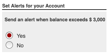
Problems arise when a designer restyles radio buttons to look like segmented buttons, chips, or tiles. Mouse users can click around, experiment, and figure it out, but keyboard-only users may get stuck wondering why Tab seems to skip past the options. Without the visual circles, it’s no longer obvious that Arrow keys (left/right or up/down) are required to navigate between choices..
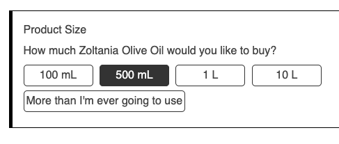
The solution is to give keyboard users just-in-time instructions when they move focus into the component. These instructions should only appear during keyboard navigation, never for mouse users, since they don’t need them. Try it below: use your keyboard to focus on one of the radio buttons and you’ll see how the instructions appear exactly when they’re needed.
Below is the code walkthrough of the above example:
Code Walkthrough of the Above Example
Below is the HTML of the above example. Use the dropdown to highlight each of the individual steps that make the example accessible.